With the arrival of our new iPhone 5S smartphones, Janna and I have been delighting in the new technology. I can’t believe how lightweight the 5S is compared to my old clunker of a 4s. Weight makes a mighty difference in the tote along tone and temperature of your day.
Here’s a caveat about the iPhone 5S camera: When you shoot in bright sunlight — as I did on September 26, 2013 — you cannot see the screen, and you are basically taking blind photographs. You rely on your iPhone to focus and try to frame what you’re hoping the camera is seeing.
There is also a new “slider set” of features on the iOS 7 iPhone camera — “square” and “pano” and “video” and such — that, if you are not careful in your screen blindness, can change the way your iPhone shoots and frames the images. Yesterday, my fingers tended to slide and select things on the new camera that I had no idea were being activated.
I like tall photographs for blog images, but some of the shots you’ll see here are the new “square” feature that I had no idea was a feature until I got home and saw the infuriating results. I did not crop any of these images. With the iPhone 5S camera, it’s “live to live again!”
Here’s the first image taken with my iPhone 5S. It’s a view of the Empire State Building in New York City and I am standing in Riverview Park.
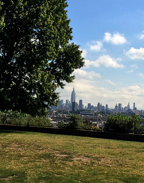
I teach ASL near the Empire State Building and it’s funny how I feel as if I can touch the building from Jersey City — it’s RIGHT THERE! — but it takes me an hour of travel to actually, physically, stand next to that architectural wonder.
In this next shot, I moved forward to the fence you see in the previous picture, and I used the “pinch to zoom” feature to try to bring the Empire State Building even closer to me.
The “software zoom” effect is grainy and fuzzy and watercolor-ish — can’t say I like it much — the day was slightly hazy and no filters were added, or harmed, in the taking of this photograph. That’s Hoboken in the fore frame:

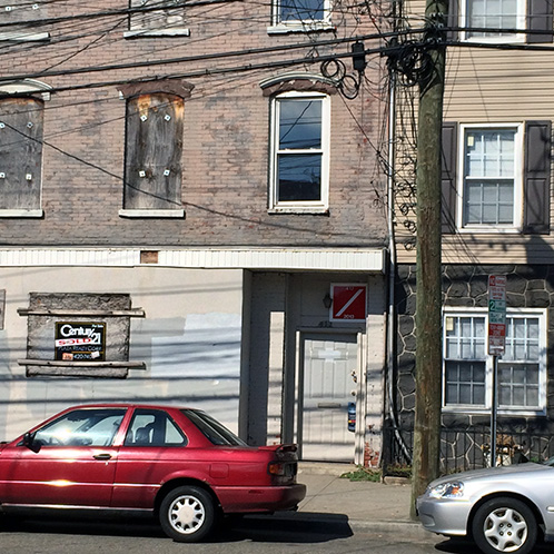
My next image was based on a previous decision to record the mysterious Red Squares that have been pocking abandoned and vacant buildings in Jersey City for several months.
The Red Squares are a little scary because they represent emptiness and blight — and could be taken as easy street notifications for future squatters and potential drug dens — but they are also fascinatingly coded to reveal a quick description about what is, and is not, hiding inside.

Here’s the same house with the image taken two steps to the left to try to lighten up the image.
Yes, you’re seeing the infamous iPhone “lens flare” that plagued the 4s here again on the 5S. I guess the secret to taking great images with the 5S is to never shoot into the non-sunny side of the street from the sunny side of the street at noontime or you’ll end up with dark or lens-flared photographs.

If this article didn’t happen to also be a mini-review of the iPhone 5S camera, the previous two images would not have made publication because they are so awful — but they do tell a story about iPhone photography warrants, as well as helping to set up the next step in this photo essay — the mysterious “Red Squares” marking abandoned and vacant buildings in the Jersey City Heights.

Here’s quite a magnificent closer example of publicly coded Urban Semiotic messages.
The “X” means “No Entry.” The “F/O” means “Floor Open” and the “R/O” means “Roof Open.” I believe “F/E” means the “Fire Escape is Damaged.”

Jersey City building owners are required to place Red Square notifications in order to protect the Fire Department and other emergency First Responders from vacant and abandoned properties, but sometimes that doesn’t happen, and the Fire Department has to step in and post their own signs.

In this example, no markings mean the building is simply vacant and not a threat to firefighters.

Now we begin the odd — “Red Square Red Car Hauntings” — part of this journey, where red cars appear in the photographs as if being placed there by other-worldly squires of the “Red Squares” world.

A single “Slash” means you should “Enter with Caution.”
Here is the photograph that started the idea of this essay a month ago — ubiquitous red car included. I was on one of my famous Jersey City Heights walks, and I snapped this image of a Red Square on this building using my old iPhone 4S.

After taking that image, I began to look for other Red Squares on subsequent walks — and I found quite a few.
Yesterday, I revisited the home of the original infamy-of-inspiration, only to notice the Red Square was no longer attached to the building! That seemed like a risk to Public Health!
Then I saw the Red Square down the block, on the ground…

… and yes, and “Ugh!” — that is the Red Square that used to be on the wall. Somebody ripped down the Red Square to cover a pile of gooey doggy doody — and I decided to leave it as I found it. The “X” warning not to enter was clearly more at risk than the building itself.

Here’s another example of Red Squares abuse.
A week ago, on this vacant house, the Red Square was properly nailed to the front door for easy reading from the street.

Yesterday, a new Red Square was down, and out, and forcibly woven between the posts of a damaged front porch railing. The old, rusty, nails appear stationed below the sign ready for duty in the want of a hammer.
It’s interesting that this was an official J.C.F.D. — “Jersey City Fire Department” — sign with a printed warning not to remove the Red Square of shame. There’s even a phone number included to rat out the rats!

Red is an established warning color, and these Red Squares — these marks of Cain and these purposeful Scarlet Letters — are intended to protect people and emergency first responders, but they also tend to have a significant influence on the contentment level of a neighborhood; and that’s why I’m not surprised to see these red flags of despair slowly being defaced and damaged because, in their essence, these signposts actually damage the psyche of the city.
It is sad to see all these buildings with red marks. I does seem like advertising to those seeking shelter.
Yes, it seems like an easy invitation to bad operators. I guess the city would prefer the risk of that sort of notice than having no notification whatsoever on the outside in case of some emergency.
Interesting look at the camera on the phone and at the red squares. I am not a fan of the watercolor background at all – it really does loose definition and context .
I like the idea of the red square to warn fire fighters and first responders , but can understand the effect on the psyche of the neighborhood.
It’s funny how, during my walks, one day the red squares are missing — and then the next day they’re back to being nailed to the buildings. Someone is watching this and carefully playing the caretaker role.