When I decided to launch my newest online publication — David Boles Bells — I knew I wanted a logo that included a Kettlebell. Unfortunately, I am not a great digital artist, and so my first stop to find some design help was Adobe Stock. I found this logo that I really loved. I purchased a license, and then discovered I had no idea how to edit the image in Adobe Illustrator to personalize the logo to BolesBells.com. I did a little research to see if I could locate the artist who originally designed the logo I purchased to see if I could hire that artist to design a whole new logo for Boles Bells.
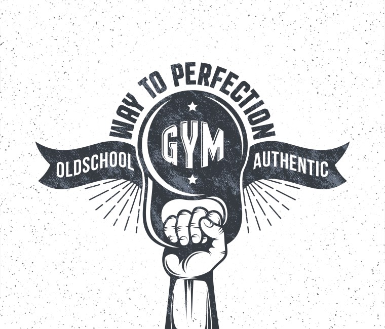
I was fortunate to quickly be able to track down the original Adobe Stock artist — Andrei Gorshkov — who agreed to let me hire him to design a whole new Boles Bells logo. We had a long, and productive, chat in email concerning ideas, and integration. I knew I wanted “Boles Bells” in there somewhere, and a Kettlebell — and I left the rest up to Andrei. Here are his first stabs at the logo idea:
![]()
![]()
![]()
![]()
![]()
I thought all of those logo ideas were swell. They perfectly reflected everything I liked about his original Adobe Stock logo I purchased. Andrei’s initial logos inspired me to drill down to what I really wanted to see in the next iteration. I realized I wanted “Boles Bells” to “be the logo” in the outline of a Kettlebell. I also wanted to be able to add, or hide, the “.com” part outside the bell. Setting the “.com” outside the logo is funny when looking at it semiotically, and even when pronouncing the website out loud. I realize I may be alone in that humor.
As you can see below, I tried to draw what Andrei’s work inspired me to wonder — and in my text explanation in email, I reminded him I didn’t flatten the bottom of the bell in my drawing, and that maybe it was too much to have the handle of the bell be “Boles” and that maybe it was better to just make a regular handle, and then put the whole “Boles Bells” in the circular part of the bell body.
![]()
Almost immediately, Andrei sent back two versions of the new logo idea — and I thought they were both excellent, and I put up the two logos for a Twitter vote — and the overwhelming winner was the one one the right, with all of “Boles Bells” encapsulated in the body of the bell.
Need your feedback and vote. I'm working on a new Kettlebell website – https://t.co/U4eVyPCSwP – currently redirecting to my main page, and I have two logo designs created for me by a really talented artist. Which logo works best for the web, for a t-shirt, for other printed use? pic.twitter.com/4FVops9Yyp
— David Boles (@DavidBoles) February 19, 2021
I told Andrei we had a deal, and to finalize the logo, and he sent me this as final confirmation of the design, and technical implementation.
![]()
Here we are today! Boles Bells launched on March 11, 2021 and we hit the road running with our new logo leading the way!
![]()
The black and white Boles Bells logo also influenced the overall design of the BolesBells.com website: Simple, clean, stark — all in black, and white, and grey! One idea blossoms into another blending!